Photo colouring tricks
The example has been made by Stephen Bird in AliveColors.
This guide assumes that you already know a little about how AKVIS Coloriage AI works and have perhaps tried it out on a couple of photos.
When you start to colour a black&white photograph, it might appear to be a daunting prospect. Just look at it - all those details, all those fiddly bits! It helps to reconstruct the scene in your mind in three dimensions.
 |
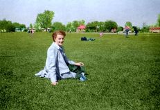 |
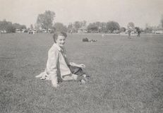
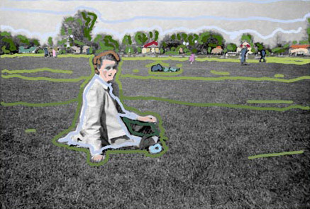
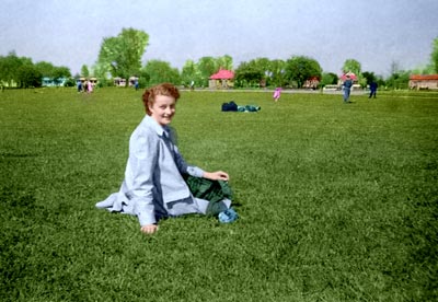
Imagine that your photo shows a family member relaxing on the grass in a park. Behind her are other visitors also taking the sun, further away is a path with people strolling. Further in the distance is a building, perhaps a cafe, surrounded by trees. And above it all, the blue sky - it was always blue in the summers of our youth, remember?
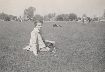
Before you start colouring the photo, call the command Auto Levels by selecting the menu item Adjustment - Auto Levels from the menu Image of AliveColors. As a result the photograph has become more contrasting.
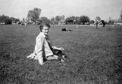
Start Coloriaging the zones in your photo from the back and work towards the front. In our example, it would the the sky. Paint a sky blue streak across the top, a lighter blue streak a little below it and a very light blue streak which closely follows the treeline. The sky is always lighter near the horizon, unless there's a storm on the way.
The next zone is the line of trees. Trees come in several colours even in midsummer so it would be a mistake to simply select one shade of green for them all. And remember that you are not colorizing the trees themselves - you are colorizing a photograph of them. If the trees are a good distance away, their colour in the photo will appear much more subdued than the colour of a leaf plucked from one of those trees and held next to the photo for comparison. The shade should be more muted.
Choose a few suitable tones and Coloriage AI the trees with spots of three or four different greens. The closer together you place the Coloriage AI paint daubs or lines, the more accurately the trees' colours will distinguish themselves. If there is a building hidden among the trees - like in our example - make sure you carefully outline the walls and roof on the foliage side with the tree green.
Closer in the photo is the building itself. Probably its roof is of red or grey slate, muted by distance from the camera - remember you don't want the actual colour of the tile but rather the colour it would appear in a photograph at that distance. Carefully outline the area of roof with the colour you want and then outline the building's walls with a suitable colour. If there are objects in front of the walls, draw a careful outline around them. Perhaps the door gets another Coloriage AI dot or two of colour. Don't make it an outrageously different colour from the walled area or roof. Being a distant detail, it's enough to merely suggest that it wasn't painted the same colour as the walls.
In our imagined photo, there are people strolling in the background but in front of the line of trees and the cafe. Their faces might get a dob of the same dark flesh tone but take care when Coloriaging their clothing. Bear in mind when the photo was taken. Until the mid-50s, people wore their Sunday best while out strolling in the park. Colouring men's trousers denim blue would not be realistic on a photo taken before 1965. And since these strollers are in the background, you can safely use browns, maroons, greys and beiges to hint at their various costumes - use colours that more or less blend in with the background since the strollers are not the subject of the photograph and there is no point in drawing attention to them with bright spots of colour.
The subject of our photo is sitting on the grass in the park so technically it is behind her. Although there is a shade of green called grass green, it's far too bright for the real thing. Grassed areas in photographs usually appear quite dark so use a medium dark green to draw over the grassed areas in front of the subject, taking care to outline her. Towards the background and the strollers on the path, the tone of green weakens and heads towards grey - not much, but it's a different shade from the grass in front of the subject.
Next the subject herself. Work again from the back to the front. Paint the skin first, outlining carefully around clothing. Then color clothing which would be next to the skin - the blouse and shoes. Next carefully outline the outer clothing - a neckscarf, jacket and skirt or swimwear. Hair counts in this category too, since it's over the skin. Last but not least, final details such as buttons and jewellery which are on top of everything.
By following the logic of "from back to front" when Coloriaging your photos, you'll be able to achieve better results quicker.
Apply the colours by pressing the button ![]() .
.
Now you can apply the changes to the image by pressing the button ![]() .
.

